personal BRAND
This piece of my portfolio is my personal brand, which I created as a way to go beyond a traditional resume and show more of how I think. I wanted a website that reflects my personality, highlights my creative side, and makes it easy to see how I approach ideas so I thought the best place to start would be with a cohesive brand.
KEYWORDS
Feminine
Editorial
Confident
Personal
Polished
DELIVERABLES
Brand marks
Color scheme
Illustrations
Patterns
Business card
CREATIVE process
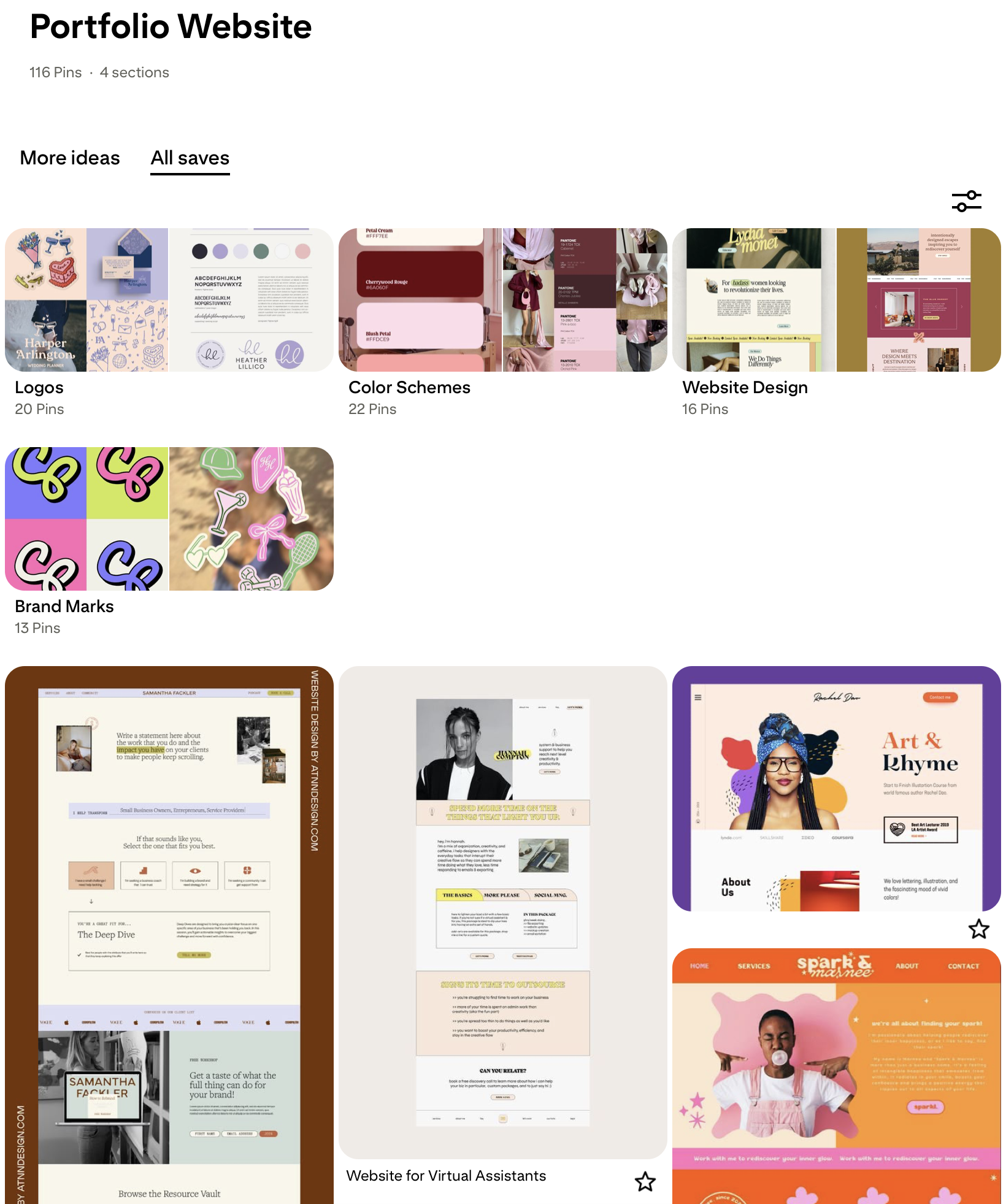
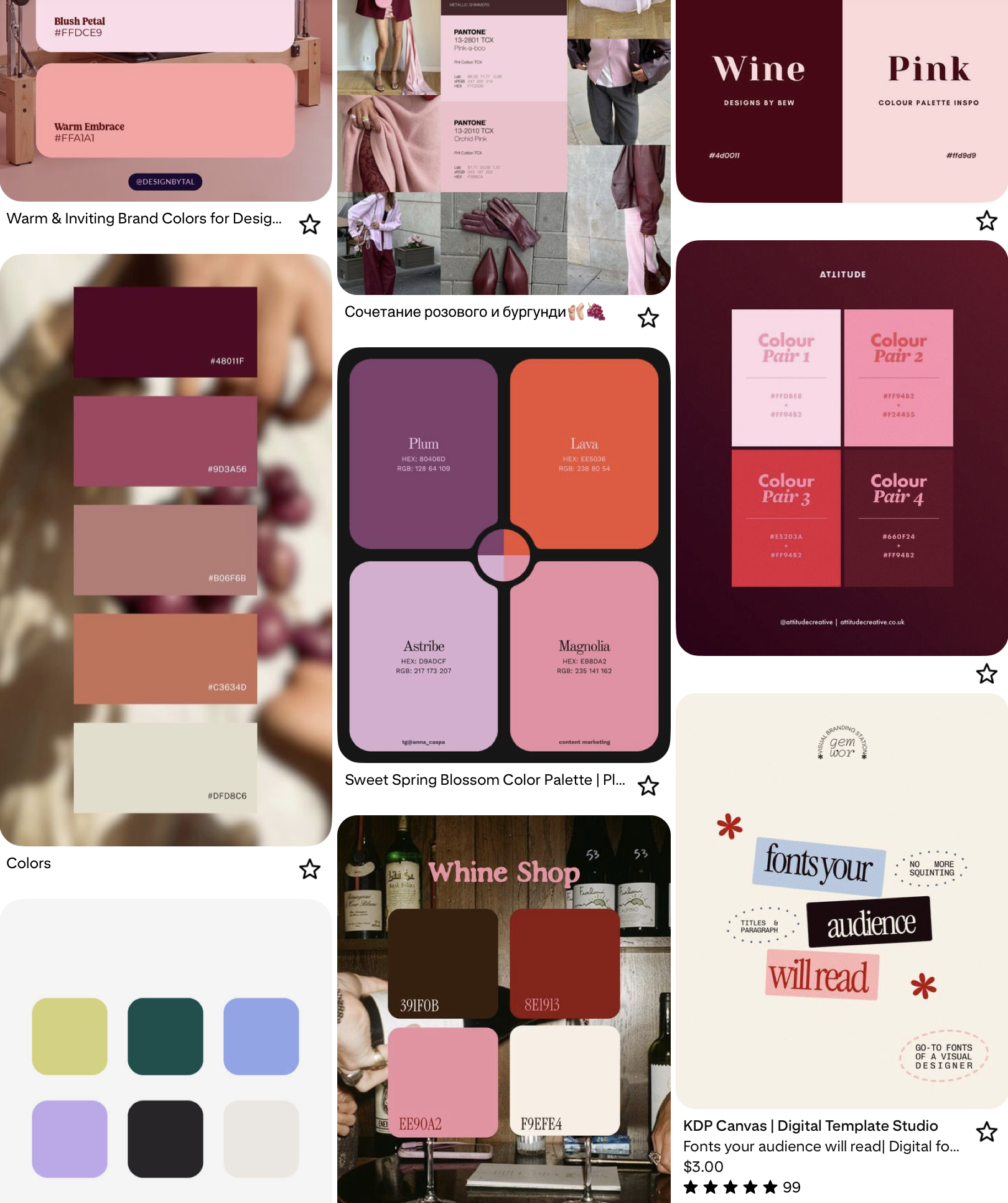
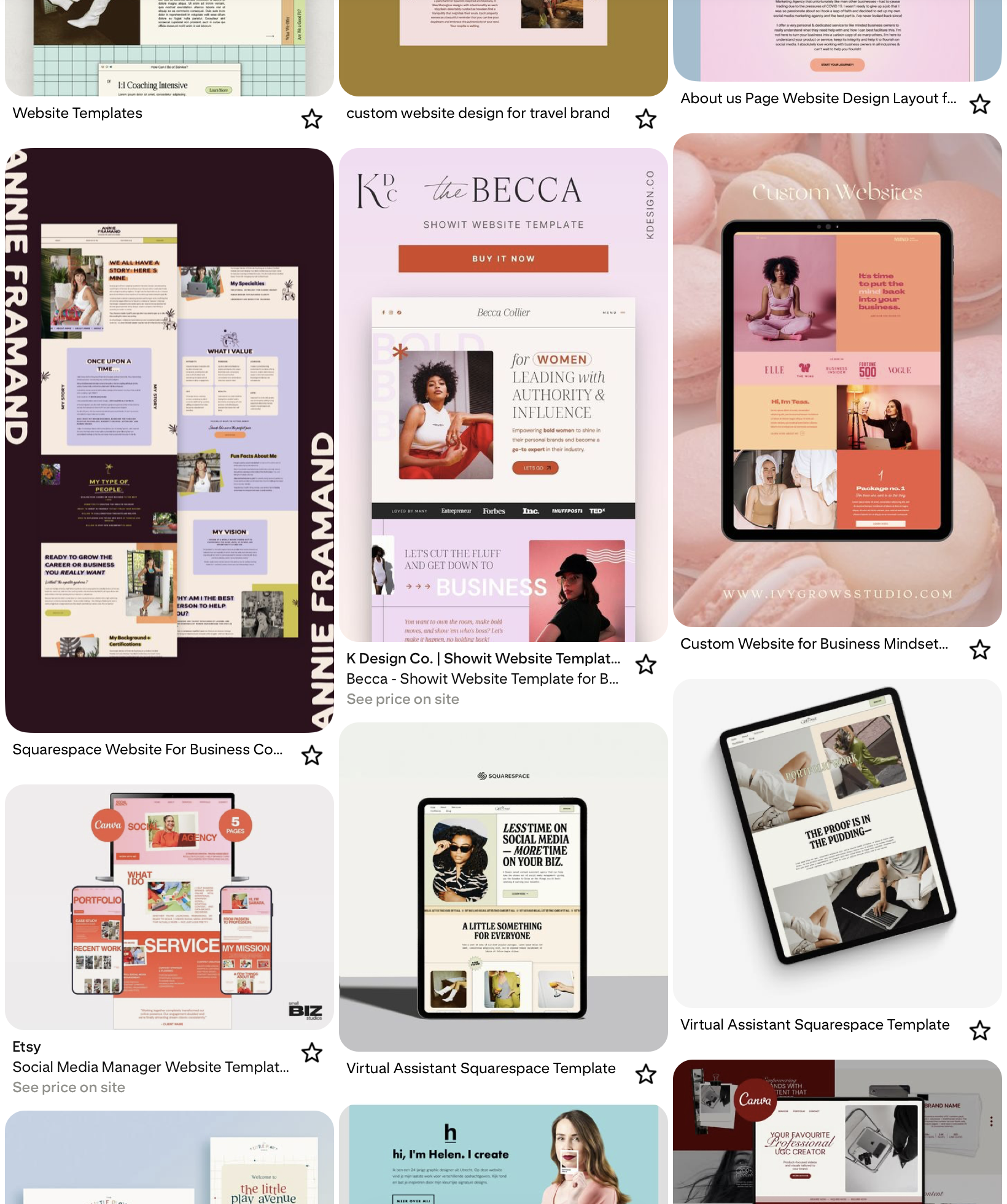
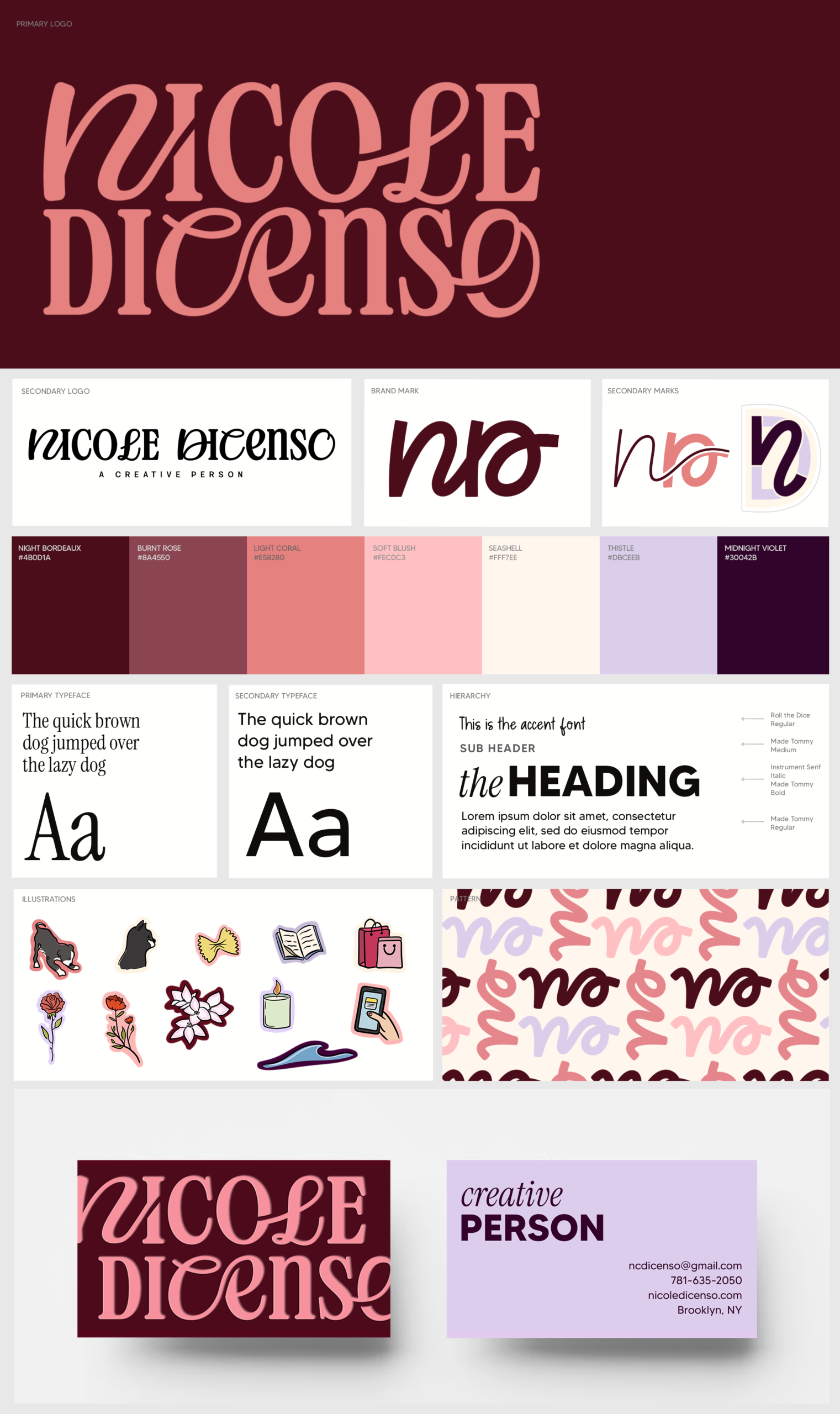
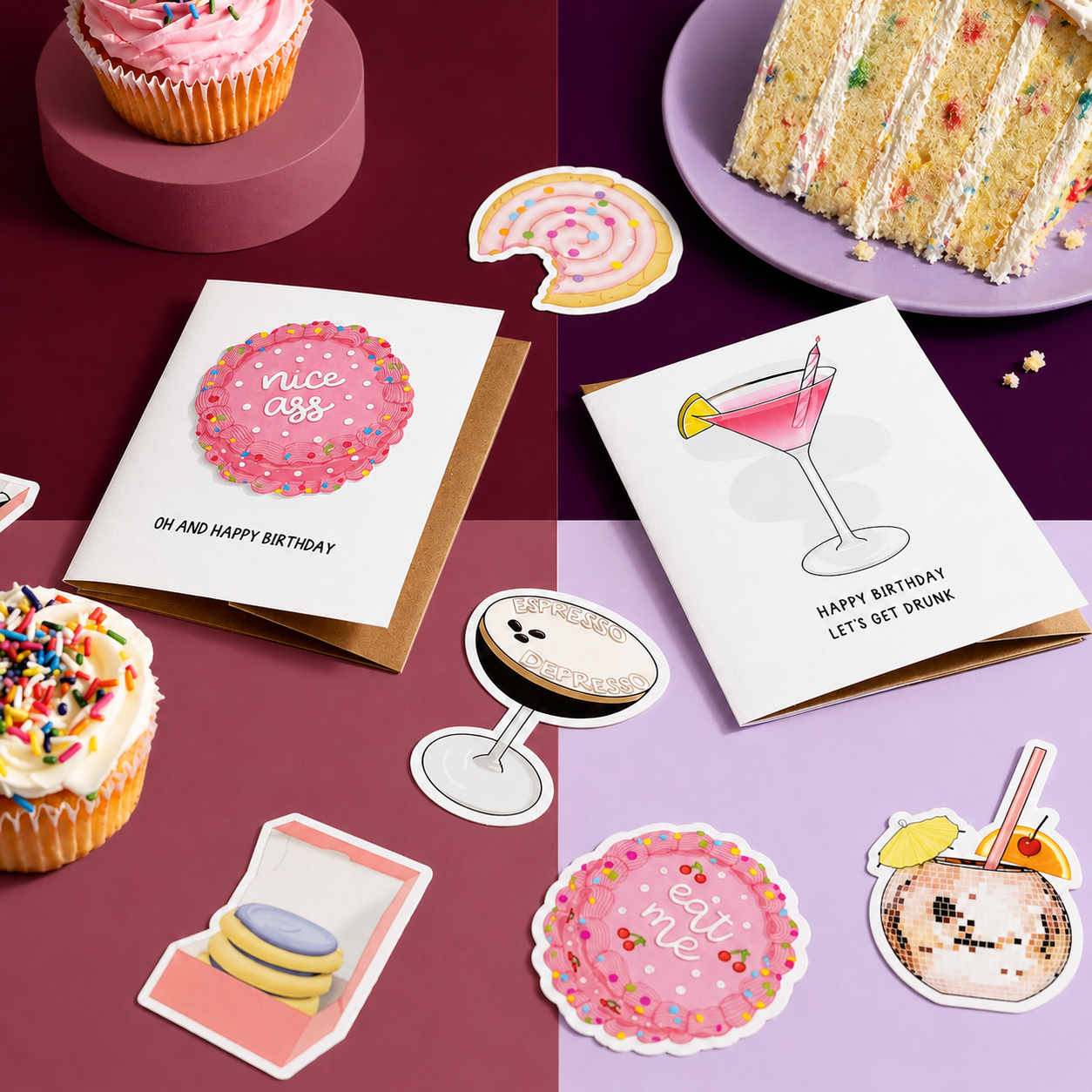
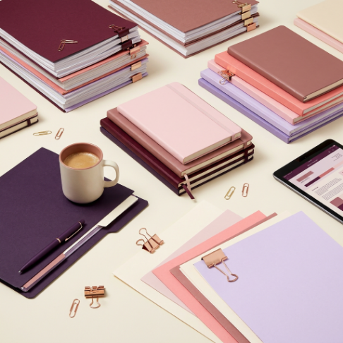
My starting point was building Pinterest boards that visually captured each of these keywords—pulling references that reflected the tone, color, typography, and overall feel I was going for. It helped translate abstract ideas into something tangible and gave me a clear creative direction before I started designing.
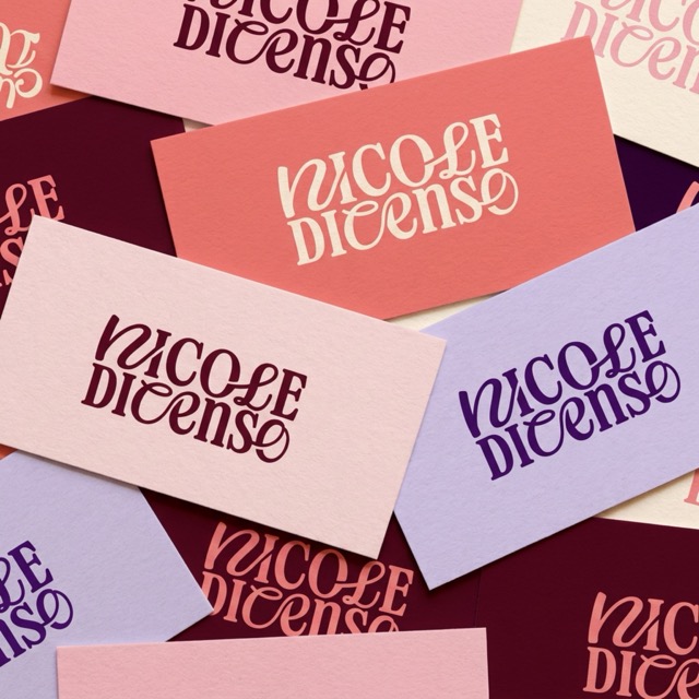
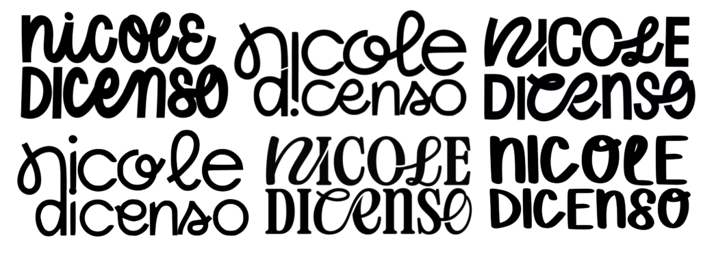
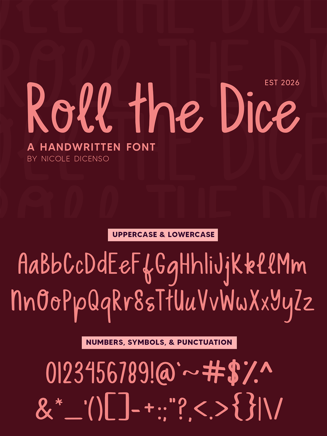
From my inspo boards, I realized I liked logos with mismatched fonts, thicker letters, script and basic font pairings, ligatures, and image/icon incorporation. Next, I spent a lot of time playing around with different logo ideas for my name. Throughout this experience I realized I did not like how my name looked and considered changing it for the sole purpose of having a prettier logo.
After deciding on a logo, I created the additional pieces of my brand kit
Color scheme
My favorite color is spiced wine so I used that as a starting point to play with color combinations. I used different pallet websites to find complimentary schemes.
ILLUSTRATIONS
I used my tattoos as inspiration for my little doodles and added color. The ones I chose are of the MA and CA state flowers, my favorite pasta (I’m italian) and my pets.
FONT
I created this font based on my own handwriting with some additional flourishes. I designed an italic and bold version as well as one with more ligatures.


This is how the
tattoo illustrations
turned out
the RESULTS